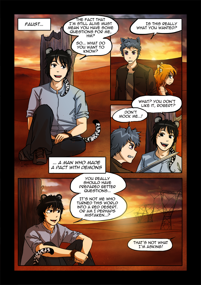
Faust

UPDATE: This page has been redrawn! Here’s the old version, if you’re curious: old version.

How do you like our main villain? Isn’t he a cutie?

18 comments on “Faust”

  1. Frogsnack Reply

    Not bad at all…! I like the coloring work you’ve done, also.

    I’l be keeping an eye on this comic (and you can do it, I didn’t think I could either, just a bit at a time, okay?)
    Feel free to contact me if you ever need any encouragement. <3

    • NotImportant Reply

      Thanks! For now everyone’s been really nice and they liked it so I am all hyped up but I guess dark times will come too, haha. I’ll be in your care then and! ;D

        • NotImportant Reply

          Ugh.. Adam made a deal with a demon so he’s being nicknamed ‘Faust’ after main protagonist of Goethe’s famous story.

  2. Adriano Reply

    I kinda forgot how awesome Faust was.
    Re-reading this is a pleasure, NI!

  3. fsdas Reply

    Home page had no link to archive. Looking forward to reading. Looks good.

    • NotImportant Reply

      That’s weird, although it does happen on my phone as well. Thanks for letting me know!

  4. Klorix Camp dweller Reply

    And you slightly changed the dialogue… perhaps to get rid of some thought squares?

    I really do like your newer free-style panel placement, especially when you put the two next to each other.

    • Dragon Master Reply

      Well if you’ll recall the broken glass panels always are used to signify when someone’s having a vision. And as we all know that’s whats going on now. I think it’s a cool touch to add this effect in.

      • NotImportant Reply

        Actually, the first time I used them they didn’t. I kind of used them randomly afterwards because I never went back to change that first place.

  5. antrik Reply

    Ada looks way more mature here… Only on this page, though. Is that because “her” panels here are entirely new, or just a coincidence?…

    • antrik Reply

      Upon closer inspection, it’s not *only* this page… Though it’s particularly pronounced here.

  6. antrik Reply

    One particularly striking difference — especially on this page — is that the new version is way more blurred. Are you drawing at a different resolution, or is it just a stylistic choice?…

    • NotImportant Reply

      Blurred? Hm I can’t see it on the phone but will check when I get home. The resolution is the same.

      • antrik Reply

        Maybe I should mention that I’m viewing at big magnification, so the pictures fill out my entire screen width… Not sure it’s noticeable at “normal” size.

        I guess some of the blurry impression might be coming from stronger use of gradients; and I’m sure a big part is the use of thinner lines and weaker contrast… But this page looks like there is some sort of blur filter applied over everything. (That’s not the case for the other new pages — or at least not nearly as strong…)

Leave a Reply to NotImportant Cancel reply

Your email address will not be published. Required fields are marked *

Facebook

Become a Facebook fan! Read the news, see sketches and notes about future pages! Join the community and share comics with your friends! Spread the love and madness!

Read More

Japan photo blog

If you are curious about my travels (well, those to Japan at least) check out my photo blog on Tumblr! Plenty of amateurish, inspirational pictures from multiple trips.

Read More

Hakeme

Digital painting tutorials by NotImportant. Completely free and for everyone who wish to learn - basic drawing tutorials, advanced digital paintings, videos, steps and tips!

Read More